|
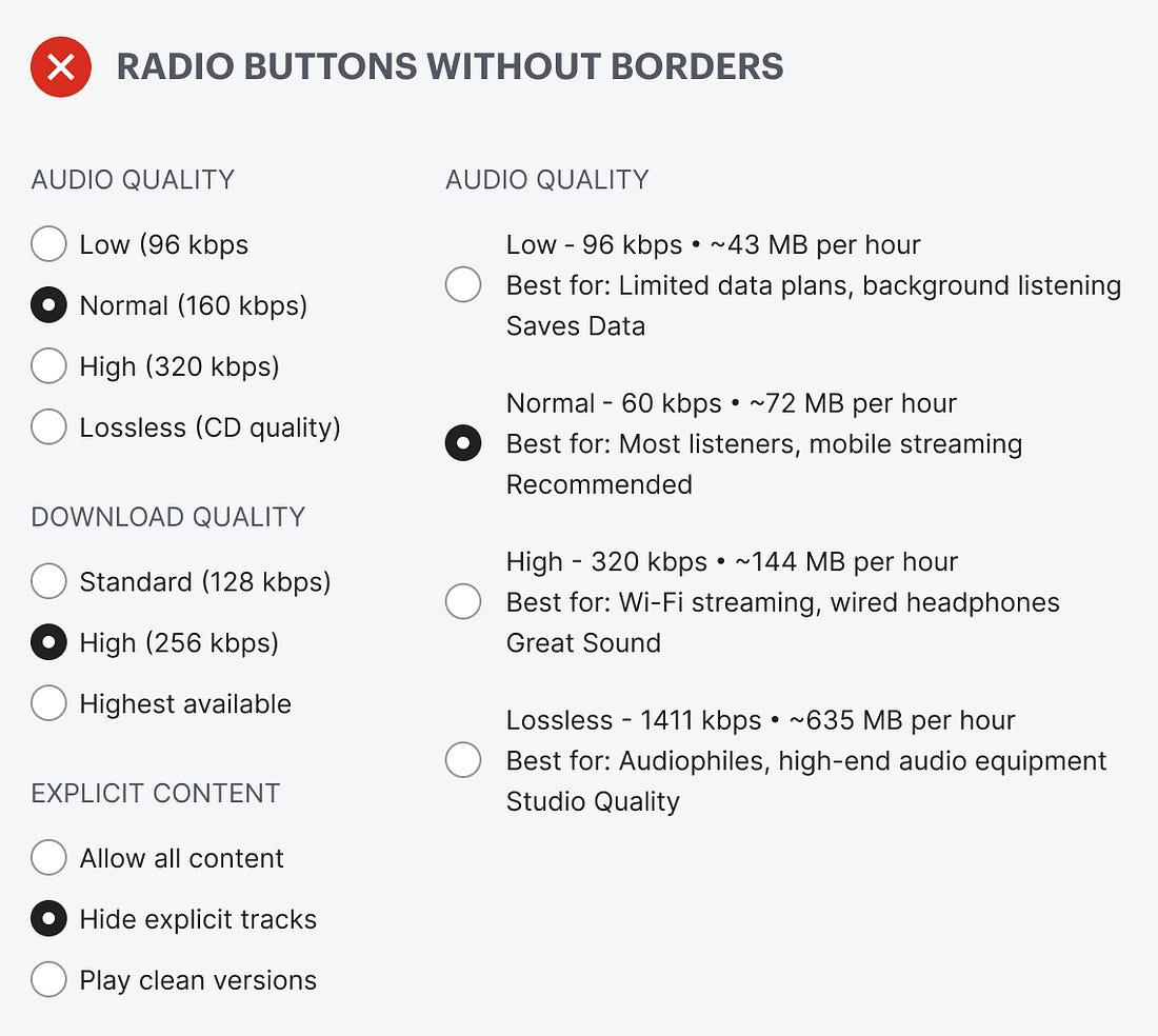
Do your radio buttons have the best user experience? Chances are, they don’t because they don’t have borders. If they don’t have borders, you’re likely making it hard for users to select options on forms and in settings.
Borderless radio buttons have no container for the text label. This makes the radio buttons harder to notice, read, and click. Just take a look at the example below. The options look like a cluster of mangled text scattered across the screen. You have to hone in on the details to read and process each option. Selecting an option shouldn’t require this much cognitive effort.
 |

Continue reading this post for free in the Substack app
![]()
![]()