Stand out with Visme’s 3D charts & graphs. Easy to use, visually impressive, and built to createadvanced 3D data visualizations without the technical know-how or steep learning curve.
Why choose 3D charts over classic ones
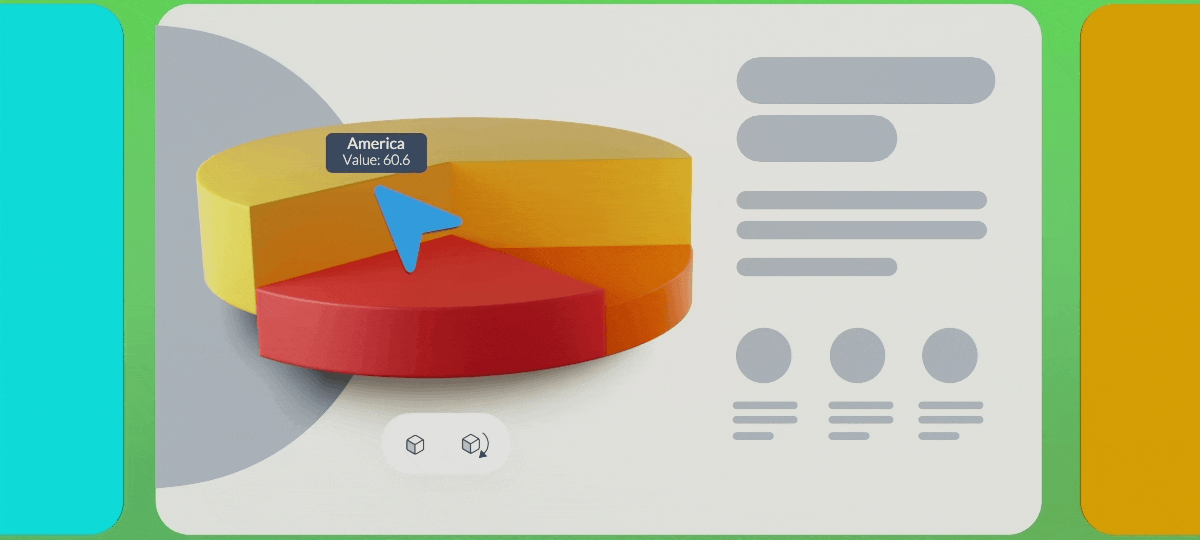
Beyond their eye-catching look, 3D charts bring an added layer of interactivity to your data. Viewers can rotate them 360° to explore information from different angles, zoom in on key details, and set your 3D chart or graph to animate automatically, spinning smoothly when viewed in shared or presented projects. This makes them ideal for visualizing complex datasets, helping you present multi-variable and layered sets of data with clarity.
Customize and brand your 3D charts & graphs
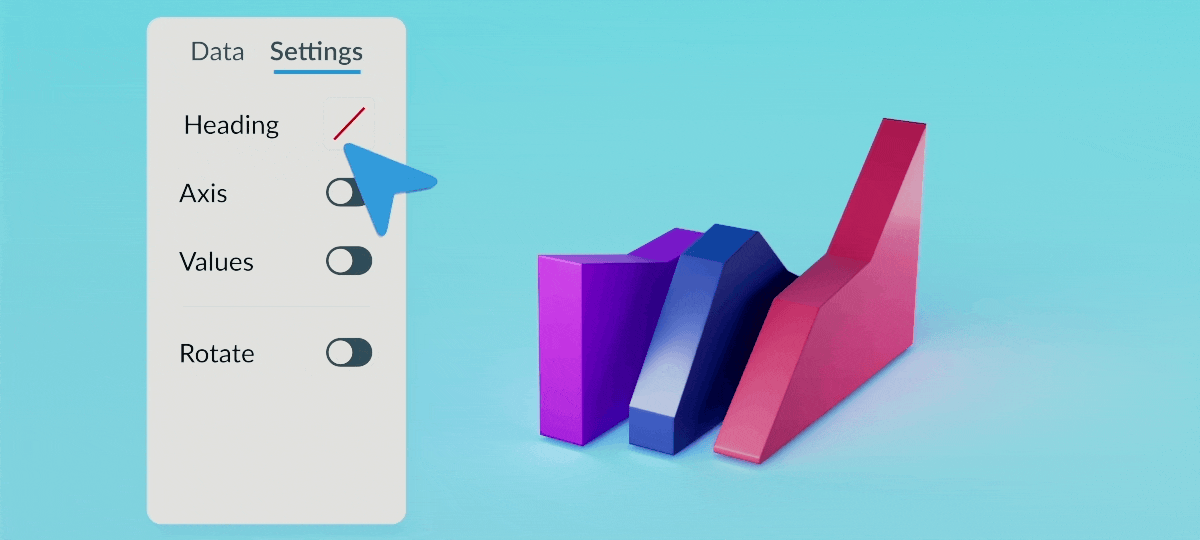
Just like other Visme 3D assets, the new 3D charts are fully customizable. You can edit values,change dataset colors to match your branding, and adjust fonts, colors, and sizes for all text elements, including titles, axis labels, and legends. Choose whether to keep or remove the background, and set the chart’s starting position to face left, right, or center for complete control over how your audience views your data.
How to add 3D charts & graphs to your projects:
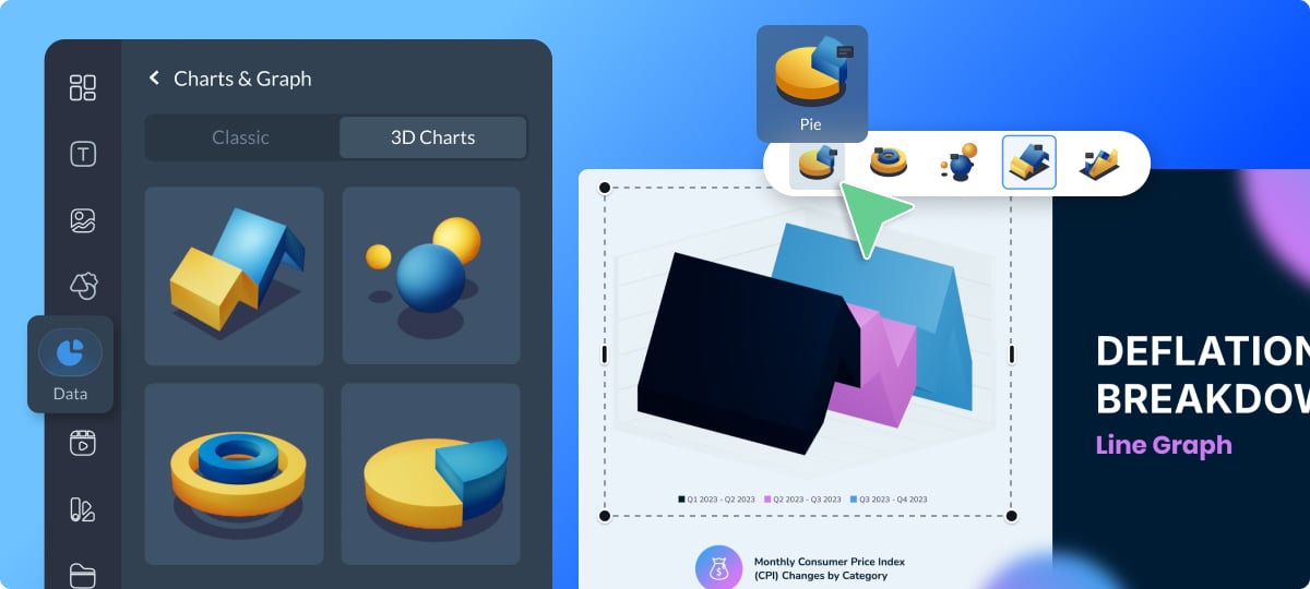
1. To get started, open your project in the Visme Editor and in the left-side menu, click Data -> Charts & Graphs.
2. At the top of the panel, choose 3D Charts from the chart type selector to explore the new options.
3.Pick the style that best suits your data, and easily switch between different 3D chart types with a single click in the menu at the top of the canvas.
4.Customize the data, colors, and fonts, plus add interactivity through the Settings tab.
Give your projects a polished, modern look with Visme’s new 3D charts & graphs. Have ideas for improvement? Share your thoughts with us here.