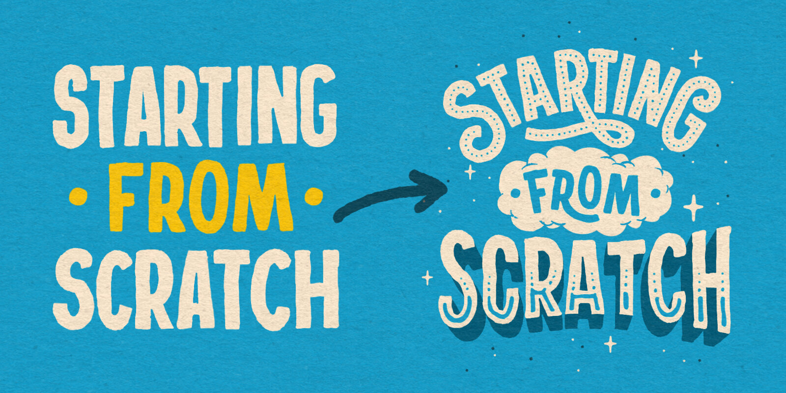
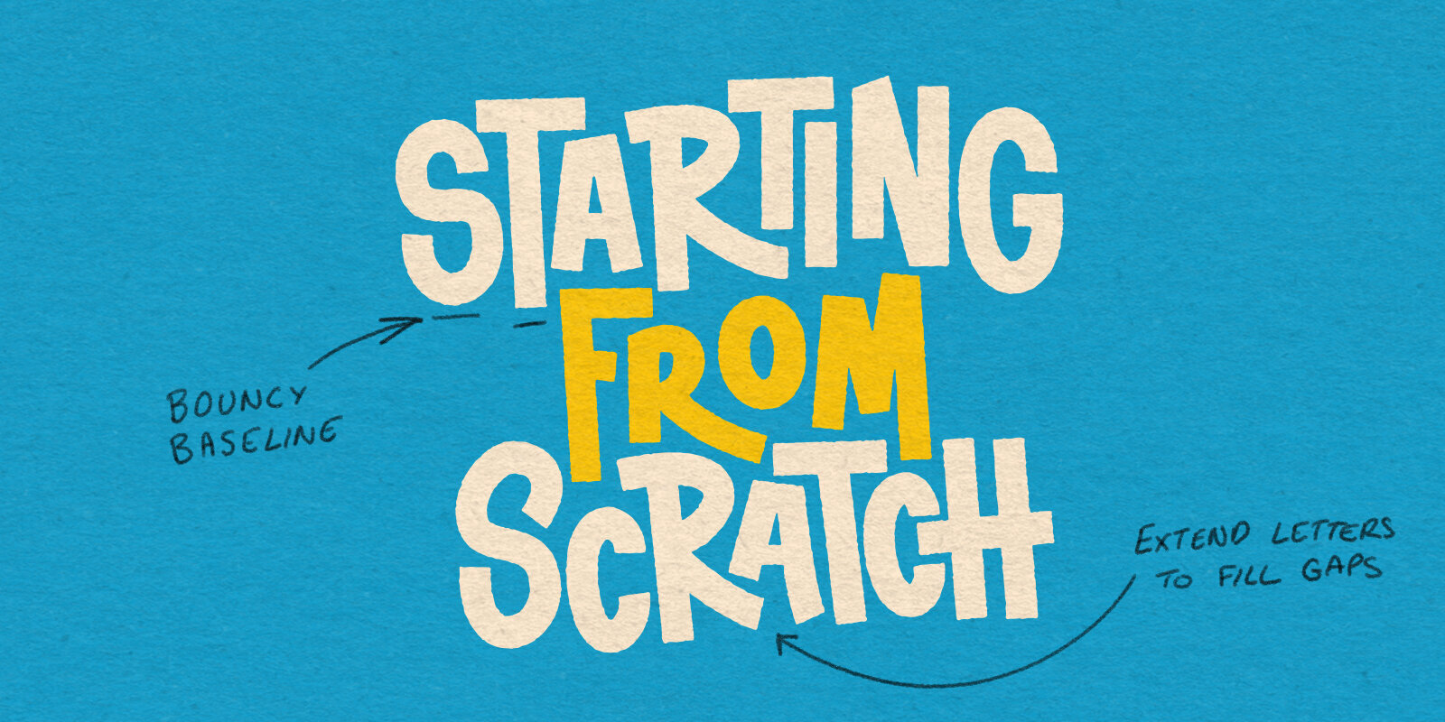
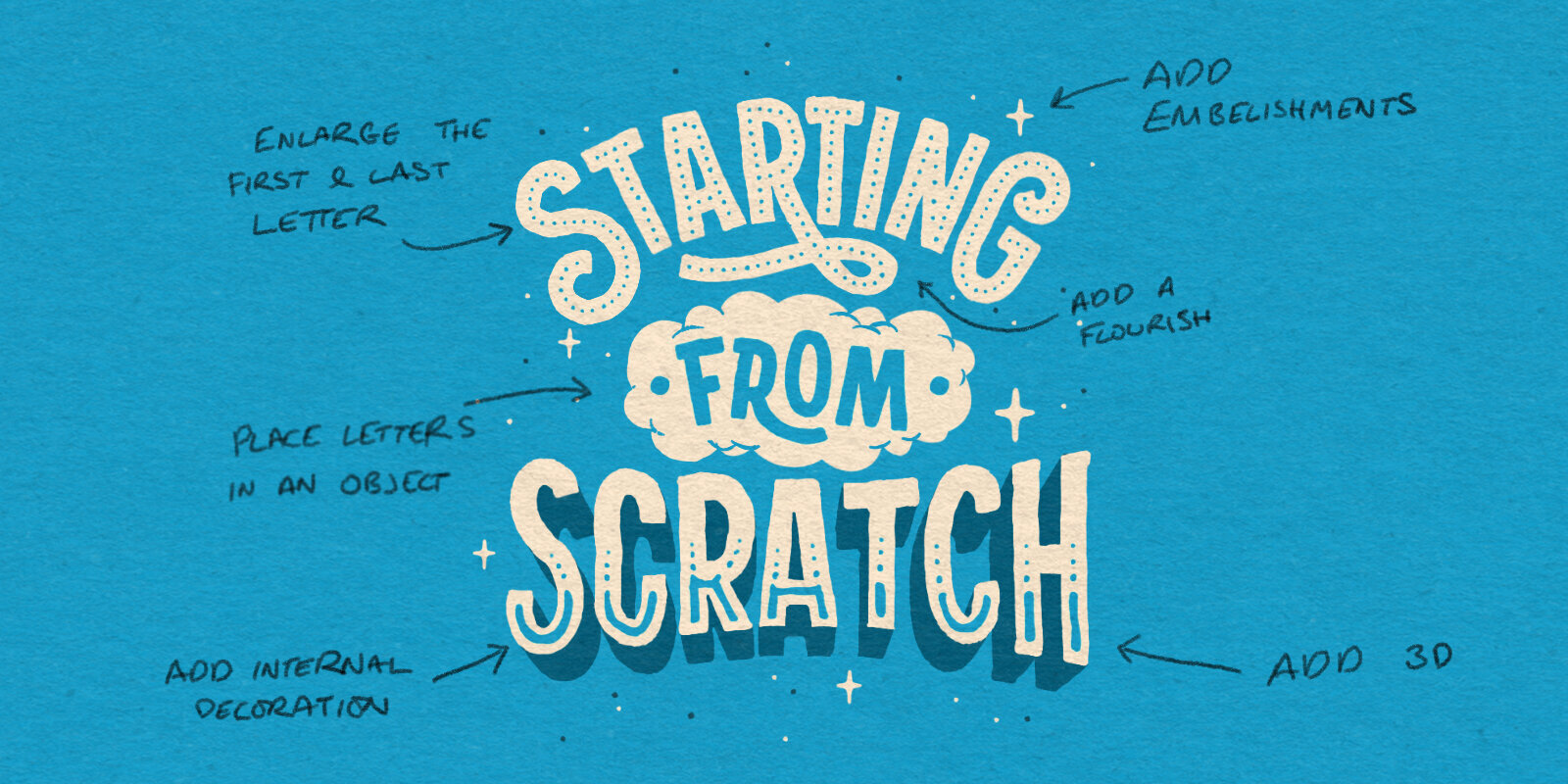
You do not always need a library of complex lettering styles to make your work stand out. Sometimes, the most professional results come from sticking to one simple style like block lettering and making small, intentional changes to how it sits on the page.
We usually start with a classic stacked layout, keeping everything horizontal and aligned. While this is a great baseline, you can create a completely different energy just by tweaking the bones of your composition.
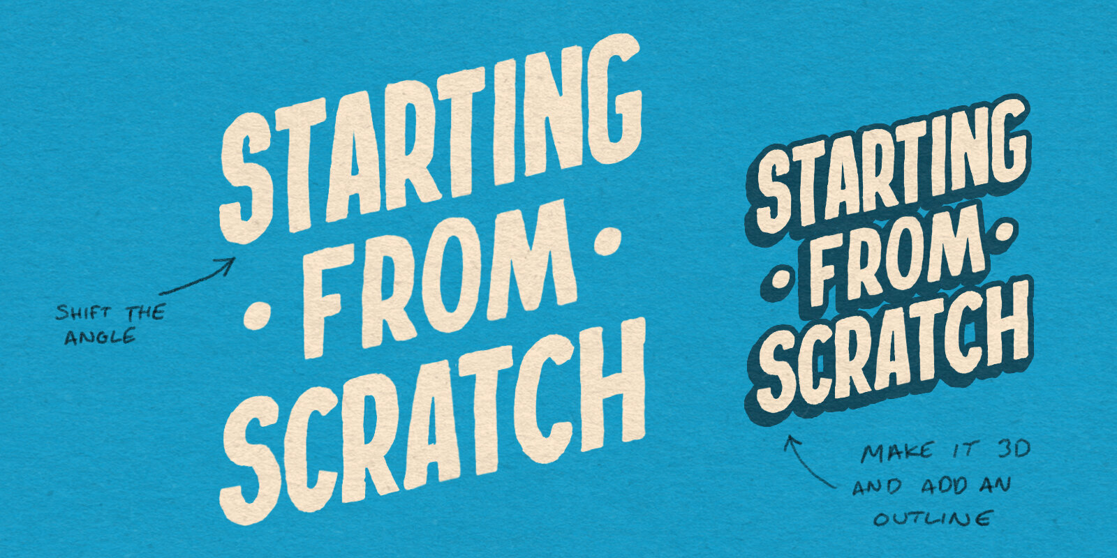
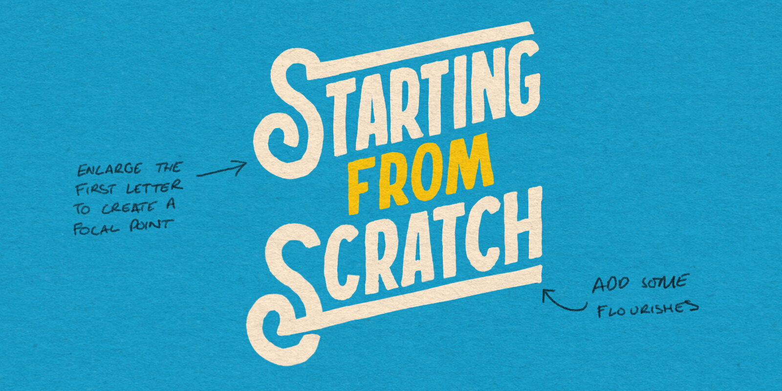
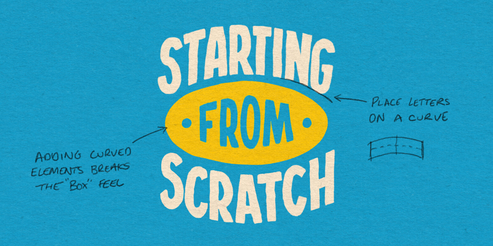
Here are five ways to transform a simple block lettering into something much more interesting: