How easy is it for users to enter dates on your form? Dates are one of the most common form fields that designers poorly implement. The design pattern you choose directly impacts speed, accuracy, and accessibility. Here’s a look at three bad patterns to avoid and the best pattern to adopt.
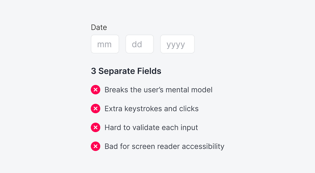
Separating the date input into three fields increases cognitive load with no real benefit. Most users think of a date as a single entity, so fragmenting it into month, day, and year fields breaks that mental model and forces artificial pauses mid-entry.